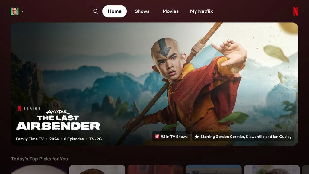
Netflix's look has remained unchanged for years, but it appears the streaming giant has grown tired of the design.
Netflix's look has remained unchanged for years, but it appears the streaming giant has grown tired of the design. the edge Testing of the new home page for the TV app is already well underway.
The first major change you'll notice is that the static tiles displaying movies and series are replaced with squares. If you hover over a specific title, the cover will instantly become larger and important data such as the premiere date and number of seasons will appear. After a few seconds, the preview starts.
Another important change is that the menu on the left is gone, and the options there (Search, Home, Series, Movies) are moved to the top of the screen. This is eerily reminiscent of the Apple TV+ solution.
Another innovation is the emergence of the My Netflix option, which displays content recommendations to users and provides easy access to saved or recently started titles. For now, they are only testing small groups, but if the reception is positive, it could reach more in a few months.


