A new TV interface would be great.
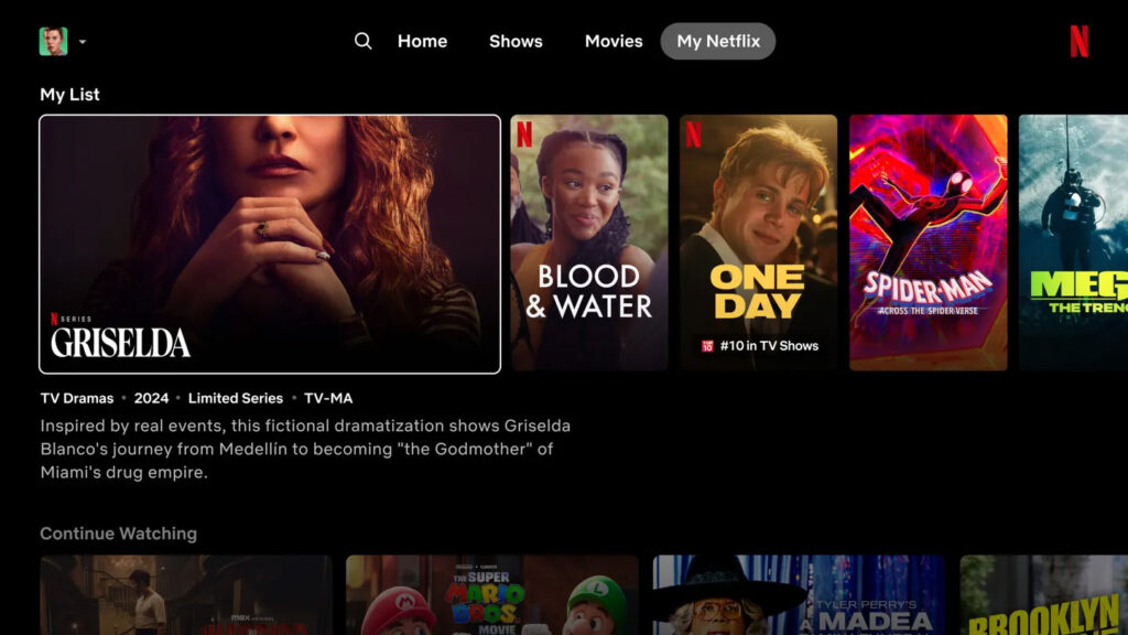
Netflix is revamping its (TV) interface: on the one hand, it offers a more modern, cleaner look that makes better use of the available screen space, and on the other hand, it provides the streaming platform with more advanced functionality that makes it easier for users to discover and select content.
Perhaps the most noticeable change is that the static tiles of content will be replaced by squares, and in these tiles, if you move the TV cursor over them, more information about the specific film and series will appear (title, genre, year of production, publication, number of episodes, etc.) , and a short trailer will also start playing, meaning you'll be able to learn about it without having to open it. We are sure to love this.
As a refresher, Netflix is moving them to the top of the screen and replacing the menu that appears on the left side of the home page with simpler options:
All of this is still in the testing phase, and it's not known when everyone will get it new Netflix, and it is not known whether the mobile and browser interfaces will also be updated.
(source: the edgeImage: Netflix, Unsplash)
You may also be interested in:


