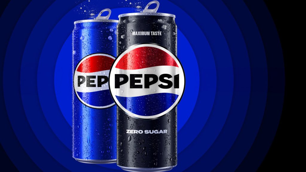
After 14 years, Pepsi's image was renewed in an unusual way, and brand fans were asked to design the updated logo.
Pepsi celebrated its 125th anniversary with a new but familiar logo, which debuted in North America last year and globally in the spring of 2024. In the new logo, the Pepsi brand name returns to the center of the red, white and blue circular wave, bringing Reminiscent of those used in the 1990s. This is no coincidence.
The brand name in the middle came to the fore again because the majority of Pepsi fans interviewed drew the logo from memory. The company implemented this kind of brand heritage throughout the redesign, in a contemporary artistic style. Thus, the updated logo received a bold font and more exciting distinctive colors, such as the new electric blue. The boldest, most vibrant and contrasting look is the first to combine Pepsi blue and black, embodying the Pepsi Zero Sugar product. The new logo symbolizes many of Pepsi's characteristics. It shows the flexibility with which Pepsi moves between physical and digital spaces. The flexible approach that defines the brand's collaboration with its partners and consumers. Also, diversify how Pepsi engages its fans where they shop, eat, work and play.
The renewed logo simultaneously reflects more than a hundred years of brand tradition, Pepsi's bold ideas for the future, and the slogan “I'm thirsty for more!” philosophy. From sports to music, delicious cuisine to entertainment, Pepsi celebrates and supports people of all ages. Accordingly, Pepsi continues to support initiatives that promote sustainability and positive choices such as sugar-free foods, diversity and moments we live with passion.


